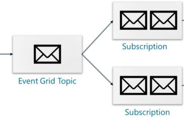
Azure: Grids, Hubs, Busses, Topics, and Queues… Oh My!
Messaging between application components and devices is why engineers invented computer networks. The ultimate computer network is the Internet, which has practically connected all the world’s devices to a single network where any one device can send a message to another device. For this reason, there are tons of solutions that provide messaging infrastructure to…
