In our last post we discussed different types your data can have. Now let’s focus on how to analyze on those types of data.
Python code will be used to demonstrate a few of these concepts. To get things start in regards to the Python code, let’s go ahead and import our packages and review our data.
import numpy as np
import pandas as pd
import matplotlib.pyplot as plt
from scipy.stats import norm
import seaborn as sns

sns.set()
%matplotlib inline
The pandas and seaborn packages will be used for the code examples. As always, the notebook is available on GitHub.
The Data Set
Before we start, let’s load in our data.
df = pd.read_csv("bank.csv", delimiter=";")
df.head()

We can learn more about what the columns mean by looking at the “Attribute Information” section on the data page, but most of these columns are intuitive to understand. We’ll be using the bank marketing data throughout the post to relate statistical concepts to as well as have a bit of fun since we’re putting the statistics into use on a real-world data set.
Analyzing on Numerical Data
Numerical data will be the most common type of data you will analyze on. These basic analyzing methods are quick and easy ways to get a better idea of what your data looks like and to help find relationships from one variable with another.
Single Variable
Analyzing a single variable may not seem like it can yield impressive results, but it actually can. By applying descriptive statistics on a variable and using a couple of plots, we can get some interesting insights.
Descriptive statistics, also called summary statistics, involves getting different sets of values – the mean, count, standard deviation, minimum, maximum, and percentiles. In Python, there are a few ways to do this. The numpy package has methods to get specific descriptive statistics. Here are a few examples:
print("Mean - {}".format(df["age"].mean()))
print("Median - {}".format(df["age"].median()))
print("Min - {}".format(df["age"].min()))
print("Max - {}".format(df["age"].max()))

In pandas this is very easy to do. Just call the describe method on the data frame object.
df.describe()

Histograms
Histograms are one of the most used graphs for presenting a single variable. The main reason for this is because histograms visualize the shape of the distribution of that variable. A distribution tells you how often a value occurs, and there is no shortage of distribution types to convey this information. One of the more well-known distribution types is a normal distribution, also known as the bell curve.
Let’s go over a few things about histograms and some terms you may hear when talking about them. We’ll first generate a random histogram. To do this, let’s take a look at a histogram of a random normal distribution using the scipy.stats package.
data = norm.rvs(10.0, 1, size=5000, random_state=0)
sns.distplot(data, kde=False) # Show only histogram

From here we can see that the mean is around 10, which indicates that most values are at or around that value. The mean, also known as the average, is a way to measure the center of a distribution of data.
The median, another way to tell what the center of a distribution of data is also around 10. We can verify this with numpy:
np.median(data)

To get the median, the data is sorted from lowest to highest and the median is the value in the middle. If there are an even number of values, then the two in the middle will be averaged to get the median.
The median and mean are usually close together.However, the mean is sensitive to outliers. An outlier is a data point that is more distant than the other data points. The outlier can skew the mean so, in that case, the median will be more accurate. For an example on how the mean can be affected by an outlier, check out this Jupyter notebook.
It is simple to calculate the standard deviation by executing the std method.
data.std()

Our standard deviation is close to 1. Since it’s low we can tell that the values are close to the mean and not very spread out, which our histogram confirms for us.
Let’s apply what we learned about histograms to our data set. Here’s a histogram of the age column.
sns.distplot(df["age"], kde=False)

Here we can tell that most of our ages are around 30. It is also evident that there are a few people who are 60 and older.
Depending on the data, it may be worthwhile to change the bins on the histogram to get a better view of the data. The bins are the intervals that are used to group data for the histogram. In the above example, the number of bins is calculated by the Freedman-Diaconis rule, but it can be manually changed.
sns.distplot(df["age"], bins=50, kde=False)

Notice how changing the bins gives us more detail in our histogram? Adjusting bins is a common form of experimentation to enhance the view of a histogram in order to gain more understanding of the distribution of the data.
If you want to go much deeper into histograms, here is an excellent interactive essay.
Box Plots
Box plots are informative graphs for your variable (or multiple variables) and can deliver powerful insights into data. To begin utilizing this insight, let’s learn how to read a box plot.
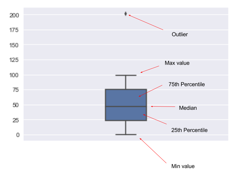
Let’s look at a box plot of the age column and see what it tells us.
sns.boxplot(df["age"], orient="v", width=0.2)

From this plot, we can see that the median age is just under 40 as well as observe that some people have an age of over 70. The plot also tells us we have some outliers as a few people are approaching 90. However, a majority of the people are between 32 to 50.
Analyzing a histogram provides a few insightful observations about our data, but a box plot offers just a bit more clarity about the data set.
Multiple Variables
A typical analysis task is to compare one variable to another in a data set. Below are a few ways in which we can analyze multiple numerical variables.
Scatter Plots
A scatter plot of two variables is often one of the first plots you’ll use to determine if two variables have a relationship or not. Let’s look at how a scatter plot visualizes our data.
sns.regplot(x=df["age"], y=df["balance"], fit_reg=False) # Don't fit a regression line

What can we tell from the graphic above? First, most points in the balance column are close to 0. Next, there are a lot of points in the age range we determined from our box plot – around 30 to 50 years old. And that there are a few points after 60 years old.
Scatter plots can also indicate if there is a linear relationship between the two variables. You can tell if there’s a linear relationship if the scatter points look like they form a line. There is somewhat of a linear relationship in the scatter plot above. However, it is around 0 which doesn’t tell us too much.
To illustrate what this linear relationship can look like, let’s look at the iris data set, which we can load from seaborn.
iris = sns.load_dataset("iris")
sns.regplot(iris["petal_width"], iris["petal_length"])

Above we included the regression line to display a fitted line to the data. With that, it shows that the data has a relatively positive linear relationship.
Pair Plots
Often you don’t know which two variables to use for a scatter plot. The data you’re working with may also have many variables to pair. Instead of manually trying out scatter plots on each of the variables, we can use pair plots to automatically create scatter plots for the variables and with the only task remaining being the interpretation of the output.
sns.pairplot(df)

What we see above is just a subset of the output generated by the pairplot method. All that’s going on here is that a scatter plot is created for each possible variable pair. If a variable is paired with itself, it creates a histogram instead of a scatter plot.
Correlations
Another insight to keep in mind when working with multiple variables is how much they correlate with each other. A high positive or negative correlation indicates that those two variables have a relationship with each other.
We can use pandas to easily give us a correlation matrix.
df.corr()

Let’s analyze this output matrix. The first thing you may notice is the left-to-right diagonal of the 1.000000 values. That is a variable correlating with itself, so that will always have a 100% correlation.
To get a visual representation of the correlation, which can help us identify stronger correlations with variables quickly, we can use a heatmap visualization.
sns.heatmap(df.corr())

Analyzing on Categorical Data
Categorical data can be seen as data that has been put into certain groups.
Bar Plots
Bar plots are often used to visualize a categorical variable. By plotting how often each of the categorical variables appears in a column, it becomes easy to identify categorical data.
sns.countplot(x=df["education"])

In the graph above, we can quickly tell that most people have a secondary education, while some decided not to answer what kind of education they have.
You can also do a bar plot against two variables where one is a categorical variable.
sns.barplot(x="age", y="marital", data=df, ci=False) # Don't show confidence interval

There are even more correlation that are possible with bar plots. With the factorplot it is possible to combine multiple bar plots with different variables to quickly identify categorical data.
sns.factorplot(x="age", y="marital", data=df, hue="loan", col="default", kind="bar", ci=False)

The plot above is a complex bar plot since it’s plotting over three categorical variables (marital, loan, and default). From this complexity comes fascinating insights, for instance, it appears that divorced people default on loans the least.
In this post, we went over several ways in which you can do statistical analysis against different types of data. Instead of showing formulas and math notations, we used Python and popular packages to do our analysis as you would as a data scientist.
Request more info or learn more about our Data & Analytics consulting services, and Data Science training courses.
