Machine-learning models fall into two broad categories: supervised-learning models and unsupervised-learning models. The purpose of supervised learning is to make predictions. The purpose of unsupervised learning is to glean insights from existing data. One example of unsupervised learning is examining data regarding products purchased from your company and the customers who purchased them to determine which customers might be most interested in a new product. Another example is analyzing a collection of documents and grouping them by similarity. Imagine an automated system that examines support tickets and assigns each of them priority 1, 2, or 3. That’s precisely the kind of task unsupervised learning can accomplish.
One of the benefits of unsupervised learning is that it doesn’t require labeled data. Suppose you want to use machine learning to build the world’s best spam filter. You need a dataset containing millions of e-mails, and each e-mail in the dataset must be labeled with a 0 for non-spam or 1 for spam. Somebody has to do the labeling, and labeling millions of rows of anything with 1s and 0s is both tedious and time-consuming. There are public e-mail datasets for which this has already been done, but in the general case in which you are using machine learning to solve a domain-specific problem, expect to spend the bulk of your time not training a model, but labeling the data that the model will be trained with.
A spam filter is a supervised-learning model. It requires labeled data. Unsupervised learning doesn’t require labeled data. The data may require other preparation – for example, you might have to remove rows with missing values or dedupe the dataset to eliminate redundancies – but it doesn’t have to be labeled.
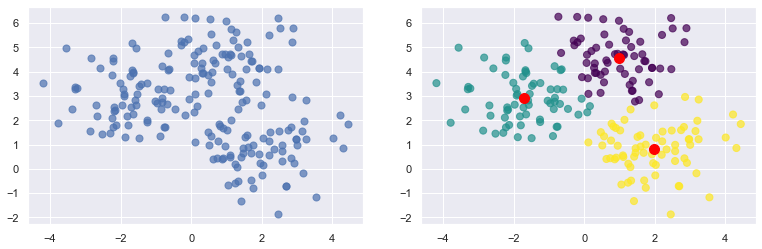
Most unsupervised learning uses a technique called clustering. The purpose of clustering is to group data by attributes. And the most popular clustering algorithm is k-means clustering, which takes n data samples and groups them into m clusters, where m is a number you specify. Grouping is performed using an iterative process that computes a centroid for each cluster and assigns samples to clusters based on their proximity to the cluster centroids. If the distance from a particular sample to the centroid of cluster 1 is 2.0 and the distance from the same sample to the center of cluster 2 is 3.0, then the sample is assigned to cluster 1. In the example below, 200 samples are loosely arranged in three clusters. The diagram on the left shows the raw, ungrouped samples. The diagram on the right shows the cluster centroids (the red dots) with the samples colored by cluster.
So how do you code up an unsupervised-learning model that implements k-means clustering? The easiest way to do it is to use the world’s most popular machine-learning library: Scikit-learn. It’s free, it’s open-source, and it’s written in Python. The documentation is great, and if you have a question, chances are you’ll find an answer by searching the Web. I’ll use Scikit for most of the examples in this series. That means we’ll be writing a lot of Python code, so if Python isn’t already installed on your computer, now’s a good time to install it. If you wish to follow along with my examples, be sure to install Scikit, too.
Most of my code samples run in Jupyter notebooks. If you haven’t used Jupyter notebooks before, they provide an interactive and easy-to-use environment for executing Python code. They’re incredibly popular in the data-science world for exploring data, training machine-learning models, and more. You can install the Jupyter run-time on your computer and run your notebooks locally, or you can use cloud-hosted notebook environments such as Google Colab.
k-Means Clustering
To get your feet wet with k-means clustering, start by creating a new Jupyter notebook and pasting the following statements into the first cell:
from sklearn.cluster import KMeans
from sklearn.datasets import make_blobs

import numpy as np
import matplotlib.pyplot as plt
import seaborn as sns

sns.set()
%matplotlib inline
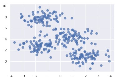
Run that cell, and then run the following code in the next cell to generate a semi-random assortment of x and y coordinate pairs. This code uses Scikit’s make_blobs function to generate the coordinate pairs, and Matplotlib’s scatter function to plot them:
points, cluster_indexes = make_blobs(n_samples=300, centers=4, cluster_std=0.8, random_state=0)

x = points[:, 0]
y = points[:, 1]

plt.scatter(x, y, s=50, alpha=0.7)
The output should look like this:
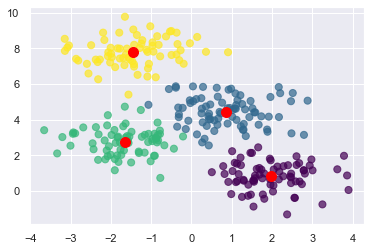
Next, use k-means clustering to divide the coordinate pairs into four groups. Then render the cluster centroids in red and color-code the data points by cluster. Scikit’s KMeans class does the heavy lifting, and once it’s fit to the coordinate pairs, you can get the locations of the centroids from KMeans’ cluster_centers_ attribute:
kmeans = KMeans(n_clusters=4, random_state=0)
kmeans.fit(points)
predicted_cluster_indexes = kmeans.predict(points)

plt.scatter(x, y, c=predicted_cluster_indexes, s=50, alpha=0.7, cmap='viridis')

centers = kmeans.cluster_centers_
plt.scatter(centers[:, 0], centers[:, 1], c='red', s=100)
Here is the result:
Try setting n_clusters to other values such as 3 and 5 to see how the points are grouped with different cluster counts. Which begs the question: How do you know what the right number of clusters is? The answer isn’t always obvious from looking at a plot, and if the data is multidimensional, you can’t easily plot it anyway.
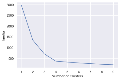
One way to pick the right number is with the elbow method, which plots “inertias” (the sum of the squared distances of the data points to the closest cluster center) obtained from KMeans.inertia_ as a function of cluster counts. Plot inertias this way and look for the sharpest elbow in the curve:
inertias = []

for i in range(1, 10):
kmeans = KMeans(n_clusters=i, random_state=0)
kmeans.fit(points)
inertias.append(kmeans.inertia_)

plt.plot(range(1, 10), inertias)
plt.xlabel('Number of clusters')
plt.ylabel('Inertia')
In this example, it appears that 4 is the right number of clusters:
In real life, the elbow might not be so distinct. That’s OK, because by clustering the data in different ways, you can sometimes obtain insights that you wouldn’t obtain otherwise.
Segment Customers on Two Attributes
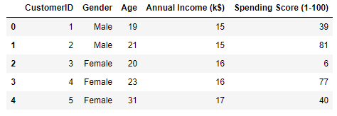
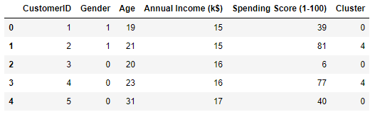
Let’s use k-means clustering to tackle a real problem: segmenting customers to identify ones to target with a promotion to increase their purchasing activity. The dataset that we’ll use is a sample customer-segmentation dataset named customers.csv. Start by creating a subdirectory named “Data” in the folder where your notebook resides, copying customers.csv into the “Data” subdirectory, loading the dataset into a Pandas DataFrame, and displaying the first five rows:
import pandas as pd

customers = pd.read_csv('Data/customers.csv')
customers.head()
From the output, we learn that the dataset contains five columns, two of which describe the customer’s annual income and spending score. The latter is a value from 0 to 100. The higher the number, the more this customer has spent with your company in the past:
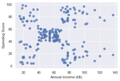
Now use the following code to plot the annual incomes and spending scores:
points = customers.iloc[:, 3:5].values
x = points[:, 0]
y = points[:, 1]

plt.scatter(x, y, s=50, alpha=0.7)
plt.xlabel('Annual Income (k$)')
plt.ylabel('Spending Score')
From the results, it appears that the data points fall into roughly five clusters:
Use the following code to segment the customers into five clusters and highlight the clusters:
kmeans = KMeans(n_clusters=5, random_state=0)
kmeans.fit(points)
predicted_cluster_indexes = kmeans.predict(points)

plt.scatter(x, y, c=predicted_cluster_indexes, s=50, alpha=0.7, cmap='viridis')
plt.xlabel('Annual Income (k$)')
plt.ylabel('Spending Score')

centers = kmeans.cluster_centers_
plt.scatter(centers[:, 0], centers[:, 1], c='red', s=100)
Here is the result:
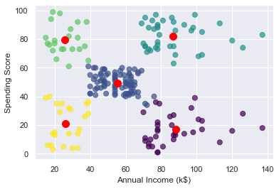
The customers in the lower-right quadrant of the chart might be good ones to target with a promotion to increase their spending. Why? Because they have high incomes but low spending scores. Use the following code to output the IDs of those customers:
# Get the cluster index for a customer with a high income and low spending score
cluster = kmeans.predict(np.array([[120, 20]]))[0]

# Filter the DataFrame to include only customers in that cluster
clustered_df = df[df['Cluster'] == cluster]

# Show the customer IDs
clustered_df['CustomerID'].values
Segment Customers on Many Attributes
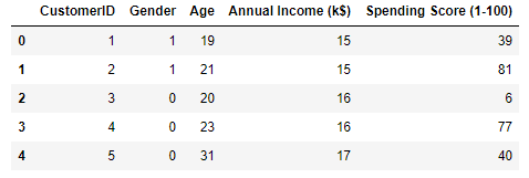
The previous example was an easy one because you used just two variables: annual incomes and spending scores. You could have done the same without help from machine learning. But now let’s segment the customers again, this time using everything except the customer IDs. Start by replacing the strings “Male” and “Female” in the “Gender” column with 1s and 0s, a process known as label encoding. This is necessary because machine learning can only deal with numerical data.
from sklearn.preprocessing import LabelEncoder

df = customers.copy()
encoder = LabelEncoder()
df['Gender'] = encoder.fit_transform(df['Gender'])
df.head()
Here’s the output. Observe that the “Gender” column now contains 1s and 0s:
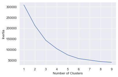
Extract the gender, age, annual income, and spending score columns. Then use the elbow method to determine the optimum number of clusters based on these features.
points = df.iloc[:, 1:5].values
inertias = []

for i in range(1, 10):
    kmeans = KMeans(n_clusters=i, random_state=0)
    kmeans.fit(points)
    inertias.append(kmeans.inertia_)

plt.plot(range(1, 10), inertias)
plt.xlabel('Number of Clusters')
plt.ylabel('Inertia')
The elbow is less distinct this time, but 5 appears to be a reasonable number.
Segment the customers into five clusters again, and add a column named “Cluster” containing the index of the cluster (0-4) the customer was assigned to the output:
kmeans = KMeans(n_clusters=5, random_state=0)
kmeans.fit(points)
df['Cluster'] = kmeans.predict(points)
df.head()
Here is the output:
You have a cluster number for each customer, but what does it mean? You can’t plot gender, age, annual income, and spending score in a 2-dimensional chart the way you plotted annual income and spending score in the previous example. But you can compute the median (average) of these values for each cluster and learn more about what the clusters mean. The code below creates a new DataFrame with columns for average age, average income, and so on. Then it shows the results in a table:
results = pd.DataFrame(columns = ['Cluster', 'Average Age', 'Average Income', 'Average Spending Index', 'Number of Females', 'Number of Males'])

for i in range(len(kmeans.cluster_centers_)):
    age = df[df['Cluster'] == i]['Age'].mean()
    income = df[df['Cluster'] == i]['Annual Income (k$)'].mean()
    spend = df[df['Cluster'] == i]['Spending Score (1-100)'].mean()

    gdf = df[df['Cluster'] == i]
    females = gdf[gdf['Gender'] == 0].shape[0]
    males = gdf[gdf['Gender'] == 1].shape[0]

    results.loc[i] = ([i, age, income, spend, females, males])

results.head()
Here is the output:
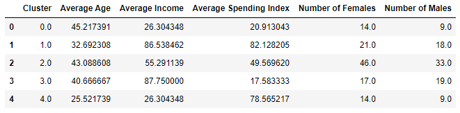
Based on this, if you were going to target customers with high incomes but low spending scores for a promotion, which group of customers (which cluster) would you choose? Would it matter whether you targeted males or females? For that matter, what if your goal was to create a loyalty program rewarding customers with high spending scores, but you wanted to give preference to younger customers who might be loyal customers for a long time? Which cluster would you target then?
One of the more interesting insights that clustering reveals is that some of the biggest spenders are young people (average age = 25.5) with modest incomes. Those customers are more likely to be female than male. All of this is useful information to have if you’re growing a company and want to better understand the demographics that you serve.
Get the Code
You can download a Jupyter notebook containing all of the examples in this post from the machine-learning repo that I maintain on GitHub. The repo’s “Data” subdirectory contains the customers.csv file, too. Feel free to check out the other notebooks in the repo while you’re at it. I’ll use some of them in future posts. And be sure to check back from time to time because I am constantly uploading new samples and updating existing ones.
